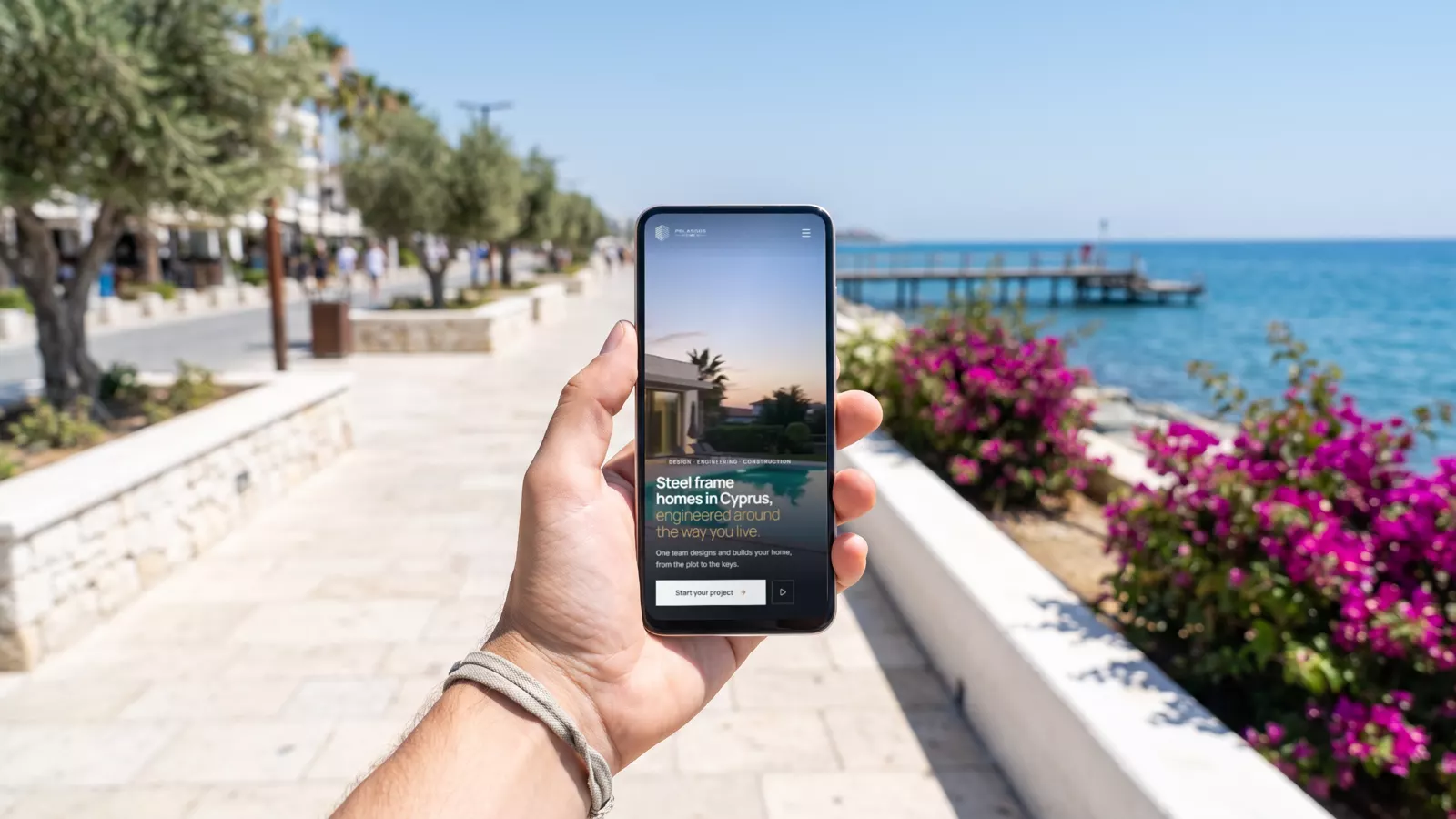
Google looks at the phone version first
Google uses the phone version of your website to decide where it appears, also for people searching on a computer. A site that works on a computer but not on a phone is judged by its weakest version.
What "fast" means
- The main content appears quickly, without a blank screen while things load.
- The page reacts at once when someone taps a button.
- Nothing jumps around while the page loads, so nobody taps the wrong thing.
- Google measures these three things on real visitors' phones and uses them when it ranks pages.
What slows a website down
Photos much bigger than the screen needs, fonts and scripts loaded from other companies' servers, chat widgets and trackers that load before anything else, and templates carrying features nobody uses. See custom website or template.
How we build for phones
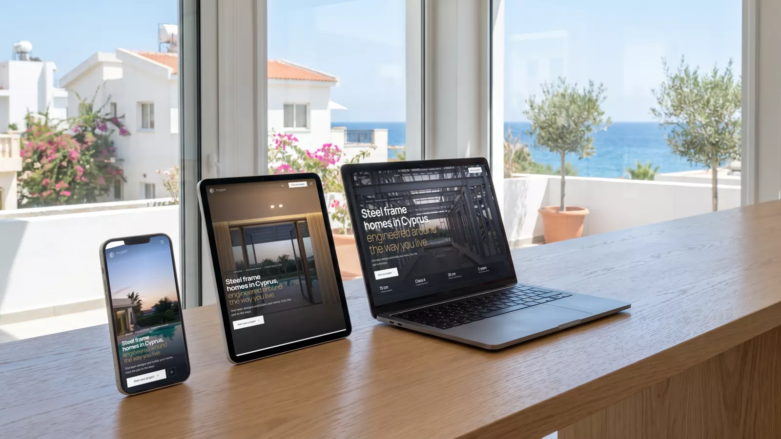
- Every page is designed for a phone first, then for a tablet and a computer.
- Pictures are sized for each screen and saved in modern formats.
- Fonts and scripts are served from the website itself.
- Buttons to call, WhatsApp or book are easy to tap with a thumb.
- We check every page on real phones, tablets and computers before launch.
Check your own site
Open your website on your phone, on mobile data, and count the seconds until you can read it and tap the phone number. Then try to book or send a message with one thumb. If either feels slow, your customers feel it too.